Wednesday, 11 December 2013
Friday, 6 December 2013
Grass test renders
Just a few tests of animating grass for my video with no colour correction, also realised that I need to change the frame rate in my project settings as well as in the save options… lesson learnt!
Tuesday, 3 December 2013
Saturday, 30 November 2013
More Renders
I really want to improve my modelling skills this year so I decided that I was going to make the complete scene in Cinema 4D and then editing in photoshop. Its a low res image as I just wanted to test the grass with the my model, still needs work and I'm not sure about the colour space and lighting, but at least I have an idea of how the final image will look.
Friday, 29 November 2013
Render tests
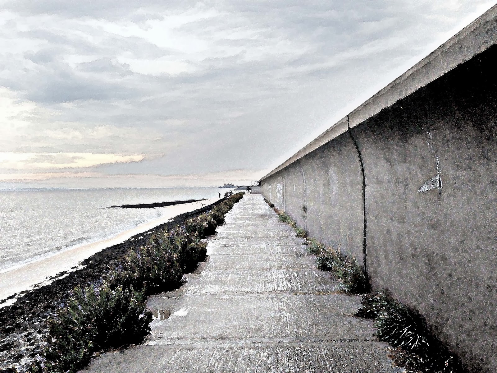
I really want to improve my lighting and texturing skills so I've been having a bit of a play with one of my previous models using different lighting techniques. I've also been thinking of about how I want Canvey to look as the back drop to my models. My intentions are to start work on another model whilst using my previous model to try and create the right type atmosphere for my project
Tuesday, 26 November 2013
Draft Video and model
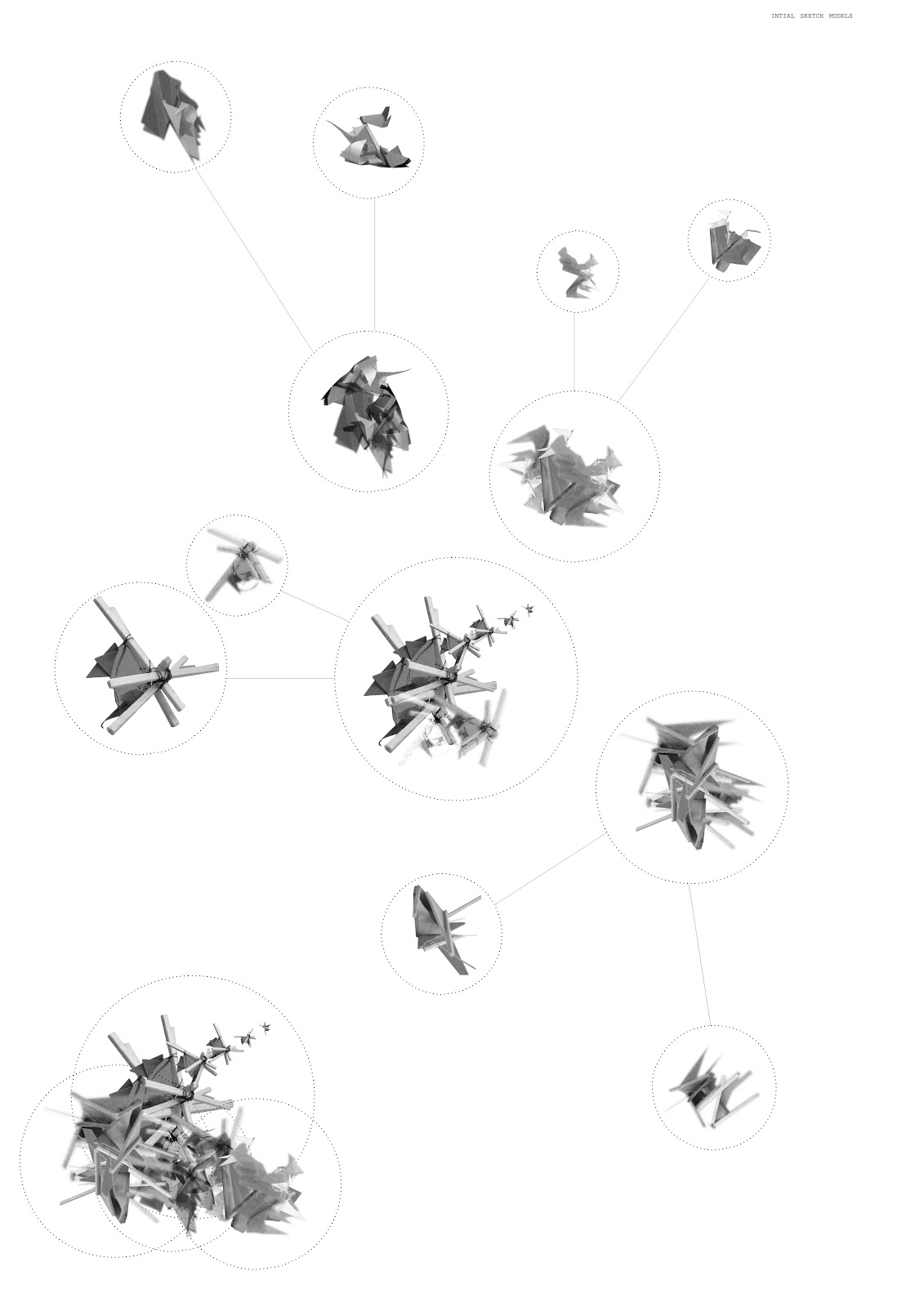
Here is my draft video for the establishing shot task, It still needs a lot of work as I don't think that it is working as well as it could do, I've also been looking at the hotel types to help inform my design work. I'm finding it difficult to try and unify my work as well as actually come up with new ideas for a new models each week therefore I have started to think of a set of tactics I can deploy to help create a new hotel. Last week we discussed Canvey heights last week and talked about creating structures that where at least 15ft high this got me thinking about the bug life in the area. Could I take example photographs of the bugs in particular macro shots and create a collage / sketch from this to form the basis of a model?
Collage that has formed the basis of the model that I am currently working on.
Monday, 25 November 2013
Last weeks crit sheets
The following are sheets from my crit last week/ portfolio pages, it was good to see them in actual print format as the are too small and so I need to rethink my formatting. Using A3 paper is probably the easiest option as it means I can print from home. I may try a combination of drawings using A3 as a base size with large format drawings folding.
Wednesday, 16 October 2013
Initial Proposal
SITE
PROPOSAL
The Hotel - Post Scarcity
I've also been thinking about how I will treat the footage I create for my video, I've spent quite a bit of time trying to make the scene seem less static as a still although I don't think that it has been that successful. I have uploaded 2 of the treatments that I have been working on along with the original image after a little bit of photoshop work
Tuesday, 1 October 2013
Monday, 3 June 2013
Tuesday, 21 May 2013
Summer Term Submission
This is the most recent render of my video, I have added placeholders for missing clips film and for scenes that will need to be re-rendered.
Friday, 17 May 2013
Final Portfolio
The portfolio shows my new work since January (still a few tweaks to be made).
I've decided to create a new set of hybrid, plans sections and elevations, turning my most recent drawings into an experiential set. Here's an example of the drawing style that I'm hoping to create.
I've decided to create a new set of hybrid, plans sections and elevations, turning my most recent drawings into an experiential set. Here's an example of the drawing style that I'm hoping to create.
I also need to finish rendering video footage, and add portfolio sheets about the making of my video along with a chronogram.
Monday, 13 May 2013
Final Drawing Set
My final portfolio will be made up of a set of 16 - 17 drawings dipicting each of the performances in a different way (in plan, perspective, plan perspective hybrid and a final drawing showing the show duration) I've decided to print at A3 on matte photo paper and will present the final drawing separately to the rest of the portfolio. Also managed to improve the quality of print by changing the paper type setting. Test print included
A3 Sheet
Close up
Saturday, 11 May 2013
Dance...
Here are four variations of the plan drawings for the dance production of Romeo and Juliet, I've tried to incorporate blue into a few of the variations.
Plan options
Here are 3 different options I have been working on that now incorporate blue in the overall mapping of the 4 stages. I still want to try and work into these images some more, but at the moment I'm working on my final series of drawings. I'm thinking I'll try and incorporate sections of this image into the plan drawings that I'll do for each of the performances and then to possibly work those images back into my plan.
Friday, 3 May 2013
Film Test's
I'm trying to set up scenes which I intend to use in the final film at the moment so that I can render stills to complete an animatic of my film. I've also carried out the final two tests for techniques that I plan on incorporating into my film. The test scenes will be much slower when incorporated into the final film to match the tempo of the operatic sound track.
Wednesday, 1 May 2013
Progress
I've been reworking one of my drawings which I started during Easter... still quite a bit I want to add / try and I also think I may need to re-render some of the stills used so that the image remains crisp at A2.
I've also decided that I will expand this drawing to cover all of the different stage sets, using an A2 sheet per set and to create my chronogram. Here's and example using my image repeated.
I've also decided that I will expand this drawing to cover all of the different stage sets, using an A2 sheet per set and to create my chronogram. Here's and example using my image repeated.
A few updated portfolio pages... still need text...
My film introduction test, (still has a few stills)
Friday, 26 April 2013
Sunday, 21 April 2013
Tests
I've been looking at a few cinema 4d techniques and tutorials that I would like to try and incorporate. Here are the results of a few of the tutorials...
Tuesday, 16 April 2013
Subscribe to:
Comments (Atom)


